

This article shows how to make a two-column section responsive using CSS flex. CSS grid could be an option but I'll be going for flex. Provided below are the initial HTML and CSS codes and I’ll be explaining what each code does. For this lesson, I’ll be making use of media query.
<html>
    <section class="first-section">
        <div id="section-img">
            <img src="url.jpg" alt="" class="image">
        </div>
        <div id="section-text">
            <h1>Lorem Ipsum</h1>
            <p>Lorem ipsum dolor sit amet, consectetur adipiscing elit, sed do eiusmod tempor incididunt ut labore et dolore magna aliqua. Ut enim ad minim veniam, quis nostrud exercitation ullamco laboris nisi ut aliquip ex ea commodo consequat.</p>
        </div>
    </section>
</html>
For the css:
.first-section{
    display: flex;
    flex-wrap: wrap;
    justify-content: space-between;
    width: 90%;
    margin: auto;
}
#section-img, #section-text{
    width: 40%;
}
.image{
    width: 100%;
}
display: flex; is used because we’re making use of css flex.flex-wrap: wrap; makes the second item on the right move below the first when on mobile view.
flex-wrap: wrap-reverse; can also be used to make the item on the right go above the left. It works as the reverse of wrap. Interesting right?
justify-content: space-between; places the two items far apart on each end of the screen. Therefore, with width: 90%; and margin: auto; , the screen size we want to use is reduced or given space 10% and centralized leaving 5% on both sides of the screen.
The #section-img and #section-text have widths that both fit into the .first-section and the .image is 100% so it can take the whole 40% width of the div it's in.
Let's go to the media query. All we have to do is give the two divs full size screen (remember, on mobile view) so that the other part can be pushed down.
@media screen and (max-width: 800px) {
    #section-img, #section-text{
        width: 100%;
    }
This works fine and can be used for three and four column sections. This technique can be used for a footer. Overflow occurs when you give wrong margin and padding sizes. The items can be spaced with justify-content and the section can be given spaces on the left and right by giving it width less than 100% like 90% or 80% and then using margin: auto; to centralize.
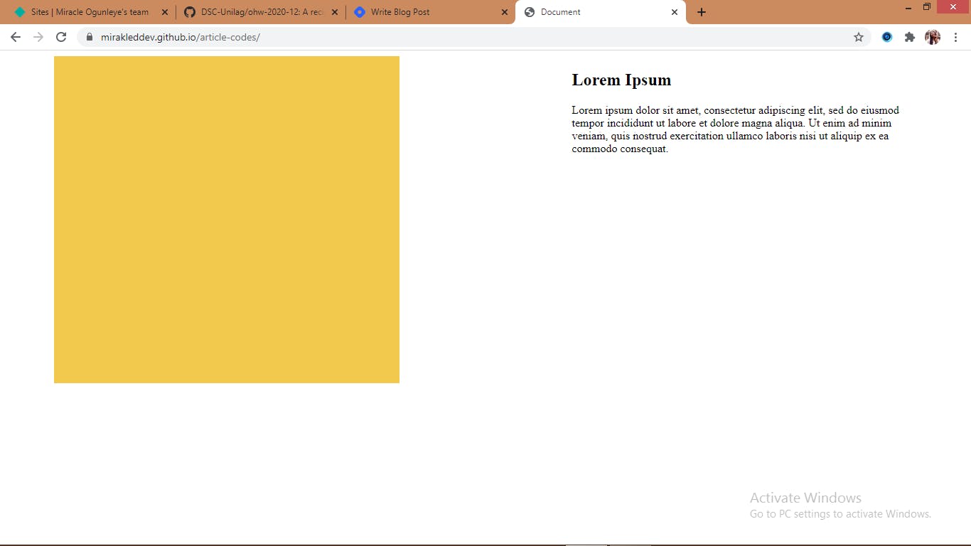 We have this on desktop view
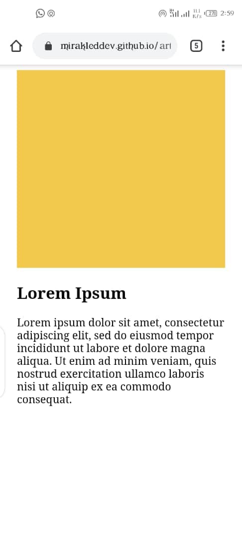 and this on mobile view. Thank me later :)